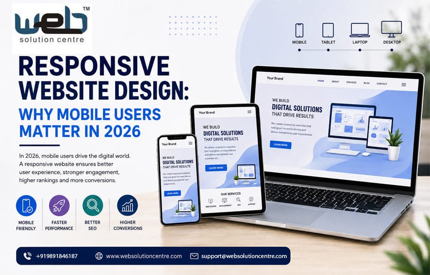
The way people browse the internet has changed dramatically. Smartphones are no longer used only for calls, messages, or social media. Today, customers use mobile devices to search for businesses, compare products, read reviews, make purchases, fill out forms, and contact service providers. For businesses, this shift makes responsive website design an essential part of a successful digital strategy.
In 2026, having a website that simply works on a mobile screen is not enough. A modern website should automatically adapt to different screen sizes, provide easy navigation, load quickly, and offer a consistent experience across smartphones, tablets, laptops, and desktops.
For businesses competing online, responsive design can influence user experience, search visibility, brand credibility, and conversions. Whether you operate a local business, ecommerce store, startup, or professional service company, mobile-friendly design should be considered a core part of your online presence.
What Is Responsive Website Design?
Responsive website design is an approach to web development where a website automatically adjusts its layout and elements according to the visitor’s screen size and device.
Instead of creating separate websites for desktop and mobile users, a responsive website uses flexible layouts, images, grids, typography, and navigation elements to provide a suitable experience across different devices.
For example, a desktop website may display several navigation options across the top of the page. On a smartphone, those same options can be presented through a compact menu. Images can resize automatically, content can rearrange itself, and buttons can become easier to tap.
The objective is simple: visitors should be able to use the website comfortably regardless of the device they choose.
Why Mobile Users Matter More in 2026
Mobile users represent a major part of today’s online audience. People often search for information while travelling, shopping, working, or simply browsing from their phones.
This creates an important opportunity for businesses. A visitor who discovers your company through a mobile search may become a customer if the website provides a smooth experience. However, if the website is difficult to navigate, slow, or poorly formatted, that potential customer can leave within seconds.
Mobile-first thinking is therefore becoming increasingly important.
A mobile visitor expects pages to load quickly, text to remain readable, buttons to be easy to tap, and important information to be accessible without unnecessary scrolling or zooming. These expectations apply to almost every industry.
Responsive Design Improves User Experience
User experience is one of the strongest reasons to invest in responsive website design.
Imagine a customer visiting your website from a smartphone and discovering that the text is too small, images extend beyond the screen, or the navigation menu is difficult to use. Even if your products and services are excellent, the website experience can create a negative impression.
Responsive design eliminates many of these problems.
A well-designed responsive website can provide:
- Easy navigation on smaller screens
- Readable typography
- Properly scaled images
- Touch-friendly buttons
- Flexible page layouts
- Simple contact and enquiry forms
- Consistent branding across devices
When visitors can find what they need without frustration, they are more likely to explore additional pages and take meaningful actions.
Mobile-Friendly Design and Search Visibility
Website design and search engine optimisation are closely connected. Search engines want to provide users with useful results and good browsing experiences.
A responsive website makes it easier to maintain one consistent website structure rather than managing completely separate desktop and mobile versions. It also helps businesses deliver the same important content across devices.
However, responsive design alone does not guarantee higher rankings. Technical SEO, useful content, page speed, website architecture, internal linking, structured data, and other optimisation factors also matter.
This is where professional digital expertise becomes valuable. A business working with a Seo Company In Delhi can develop a broader strategy that combines responsive design with technical and on-page SEO.
The result is a website designed not only for visitors but also for better search engine accessibility.
Faster Websites Create Better Experiences
Mobile users are often less patient with slow websites. A page that takes too long to load can result in visitors leaving before they even see the main content.
Responsive design should therefore be combined with performance optimisation.
Several factors can influence website speed, including oversized images, unnecessary scripts, poor hosting, unoptimised code, excessive plugins, and inefficient third-party integrations.
A modern website should use appropriately sized images, efficient code, browser caching, compression, and other performance techniques where appropriate.
Speed matters because it affects both user experience and the likelihood that visitors will continue browsing.
Responsive Design Supports Local Businesses
For local businesses, mobile users are particularly valuable. People frequently search from their phones when looking for nearby services, restaurants, retailers, professionals, and other businesses.
A potential customer may search for a service, visit a website, check the available offerings, look at contact information, and call the business within a few minutes.
If the website is mobile-friendly, this journey becomes much easier.
Important information such as phone numbers, addresses, opening hours, service details, enquiry forms, and location information should be easy to find on smaller screens.
This is one reason businesses looking for a Web Designing Company Delhi should evaluate more than just visual appearance. The website should be designed around real customer behaviour.
Responsive Design Can Improve Conversions
A website ultimately needs to support business objectives.
For some businesses, the goal may be generating enquiries. For others, it may be online sales, appointment bookings, phone calls, downloads, registrations, or product discovery.
Responsive design can help reduce barriers between the visitor and the desired action.
For example, a mobile visitor should not have to zoom in to complete an enquiry form. A shopping customer should be able to browse products comfortably and proceed through checkout without layout problems.
Calls-to-action should remain visible and easy to interact with. Forms should contain only necessary fields. Navigation should guide visitors naturally towards important pages.
These small improvements can make a meaningful difference to the overall conversion experience.
Mobile-First Design vs Responsive Design
Mobile-first and responsive design are related but not identical concepts.
Responsive design means that a website adapts to different screen sizes. Mobile-first design means that the website experience is initially planned around smaller screens and then expanded for larger devices.
In 2026, mobile-first thinking can be particularly useful because it forces designers to prioritise the most important content and functionality.
Instead of filling a desktop page with unnecessary elements, designers first determine what a mobile visitor genuinely needs. The desktop version can then provide additional space and functionality without compromising the core experience.
This approach often results in cleaner layouts and clearer user journeys.
Choosing the Right Website Development Partner
The quality of responsive design depends heavily on the development process.
Businesses should look for a development partner that understands design, programming, performance, SEO, security, accessibility, and user experience.
A Top Website Development Company Delhi NCR should be able to understand the business objective behind a website rather than treating the project as simply a collection of web pages.
Before selecting a development company, businesses should consider its experience, portfolio, development approach, communication process, technical capabilities, maintenance support, and understanding of SEO.
It is also useful to ask how the company approaches mobile performance, image optimisation, website security, content management, analytics, and future scalability.
Common Responsive Design Mistakes
Even websites labelled as mobile-friendly can have usability issues.
One common mistake is using buttons that are too small to tap comfortably. Another is placing too much content above the fold or creating long pages without proper visual hierarchy.
Large images can also create performance problems, particularly on mobile connections. Pop-ups that cover the entire screen can frustrate visitors, while complicated forms may discourage users from submitting enquiries.
Poor typography is another issue. Text should remain comfortable to read without forcing visitors to zoom in.
A professional responsive website should be tested on multiple screen sizes and browsers before launch. Testing helps identify layout problems that may not be visible during desktop development.
How Web Solution Centre Can Help
Businesses need websites that combine visual appeal with functionality, performance, and search visibility. This requires coordination between design, development, content, and SEO.
Web Solution Centre focuses on creating websites that are designed around business objectives and user requirements. From responsive business websites to ecommerce platforms and customised web development, a structured approach can help businesses build a stronger digital presence.
The focus should not simply be on creating a visually attractive homepage. Every important page should contribute to the visitor journey.
A successful website should communicate what the business offers, establish credibility, answer customer questions, and make it easy for visitors to take the next step.
The Future of Website Design Is Mobile-Ready
As digital behaviour continues to evolve, mobile accessibility will remain an important consideration for businesses. New technologies, faster devices, AI-powered search, voice interfaces, and changing user expectations will continue to influence how websites are designed.
However, one principle will remain important: websites need to work for real people.
Responsive website design provides the foundation for delivering a consistent experience across devices. When combined with strong content, technical SEO, fast performance, intuitive navigation, and conversion-focused design, it can help businesses compete more effectively online.
For companies investing in their digital presence in 2026, mobile responsiveness should not be treated as an optional feature. It should be part of the website strategy from the beginning.
Whether you are planning a new website or improving an existing one, working with an experienced Web Designing Company Delhi, a reliable Top Website Development Company Delhi NCR, and a professional Seo Company In Delhi can help bring design, development, and search optimisation together.
Read: Agentic Commerce 2026: Is Your Website Ready for AI Shopping Agents?
Leave a Reply