Are you looking to create a stunning website for your business? If so, you may have come across the terms responsive and adaptive web design. While both approaches aim to provide an optimal user experience across different devices, there are key differences that you should be aware of before choosing the right one for your website.
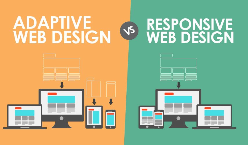
Responsive web design is a fluid approach that uses a single code base to adapt the layout of a website to the size of the screen it is being viewed on. This means that the website will automatically adjust its elements, such as text and images, to fit different screen sizes, from smartphones to tablets to desktops. This approach offers a consistent user experience across devices and is often preferred for its simplicity and efficiency.
On the other hand, adaptive web design involves creating multiple layouts for a website, each specifically designed for different screen sizes. When a user accesses the website, the server detects the screen size and delivers the appropriate layout. While this approach may require more upfront work in terms of designing and developing multiple layouts, it can result in a more customized and optimized user experience for each device.
So, which approach is best for your website? The answer may depend on your specific goals and requirements. If you are looking for a cost-effective and low-maintenance solution that provides a consistent user experience across devices, responsive web design may be the way to go. However, if you want to create a more tailored and optimized user experience for different screen sizes, adaptive web design may be a better fit.
Regardless of which approach you choose, it is important to work with a reputable Website Designing Company or Web Designing Company In Delhi that can help you bring your vision to life. With their expertise and experience, they can help you navigate the complexities of responsive and adaptive web design and create a website that effectively showcases your brand and engages your audience.
In conclusion, understanding the differences between responsive and adaptive web design is crucial in determining the best approach for your website. By working with a professional Website Designing Company or Web Designing Company in Delhi, you can create a website that not only looks great but also provides a seamless user experience across all devices.
Leave a Reply